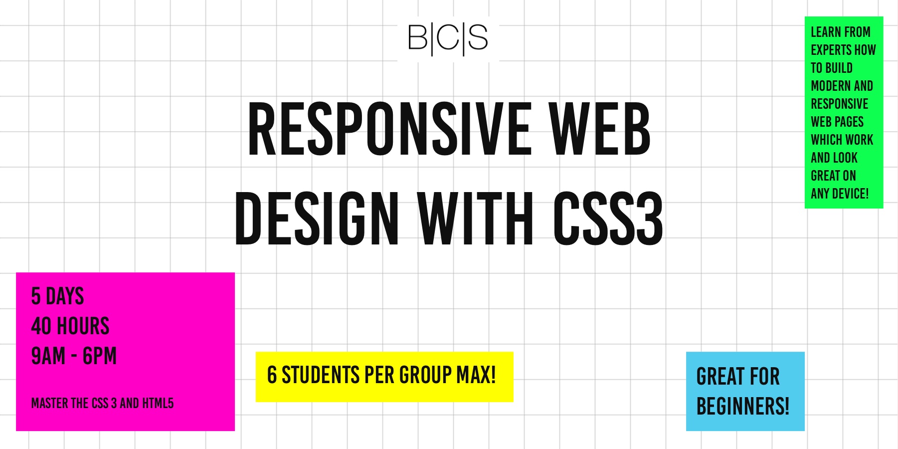
Learn how to create modern responsive websites for any devices with the latest CSS
5 days, 40 hours, full-time, in-person or live online
The outcomes
You will be able to build a layout for any kind of website
It would be a responsive layout working great on any screen size
You will know how to use custom CSS with pages generated by any type of CMS or in other cases where you don't have control over classes/ids by using combined selector and DOM logic
A portfolio of several projects created with pure CSS
What you'll learn
Creating all kinds of layout of any complexity
Using media queries to switch between desktop/tablet/mobile versions of your website
Understanding simple and combined selectors
Absolute/relative length units (the good, the bad and the ugly)
The box model
Positioning, stacking, floating your elements with/wthout taking them out of the natural document's flow
Using margins/paddings/borders
Creating layouts with CSS Grid (amen to that)
Flexbox properties and why they rule for the native mobile apps